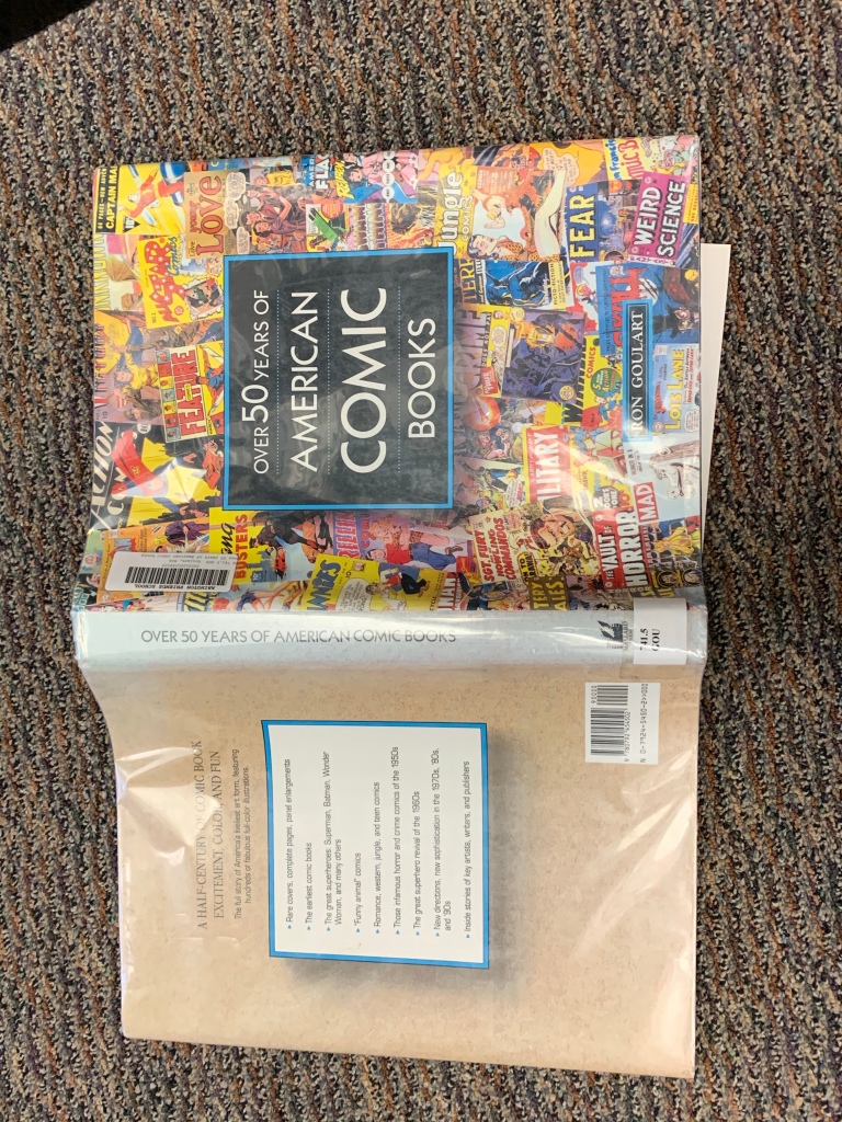
The major design components is the old school comic books on the front cover. The focal point is the title block because the background is so filled with pictures and colors that the neutrality stands out. The title text is very plain and formal while the text on the comic books are very colorful and expressive. The colors are bright and exciting and the back cover makes a great contrast because it’s so neutral and even. It balances out. My eye goes to the title block because it’s so big and it’s in the middle but then it quickly goes to the background. The organization is balanced out by the title block with the overlapping comics in the back.

